Watercoloring a graphic novel
When I was trying to decide what method to use to color The Great Gatsby: A Graphic Novel Adaptation, I was considering coloring it digitally, with markers, or colored pencils. But then a cartoonist-friend suggested that I try watercolor. She pointed out that watercolor would be the best way to capture the lush mood of The Great Gatsby, the booziness of the time period, and the beauty of Gatsby’s world. I quickly realized that she was right, but I was nervous since the last time I’d done watercolor was in elementary school art class.
So I taught myself how to do watercolor through practice, YouTube tutorials, practice, an 90-minute lesson with a local watercolor artist, and practice. I needed to cover 228 pages in watercolor in ten weeks so my focus was on speed, clarity, and, of course, beauty. Learning watercolor was a steep learning curve, but by the end of coloring the graphic novel, I found it so enjoyable to work in watercolor that I’m doing so on my next book.
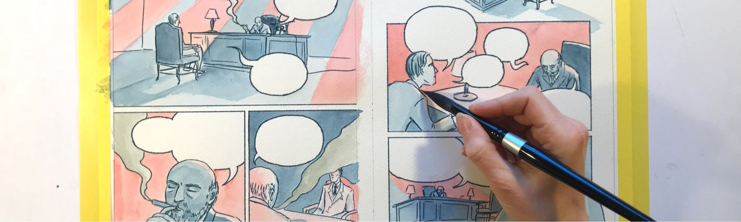
I digitally inked my pages in Clip Studio Paint, and then printed out those pages onto watercolor paper. Here’s an overview of my whole process.

Examples of my thumbnail watercolors for The Great Gatsby: A Graphic Novel Adaptation with the full-size pages at the top.
Thumbnail watercolors
At the beginning of every chapter, I would print out small thumbnail versions of each page on watercolor paper. I used these thumbnails to very quickly test color combinations and to avoid messing up on the full-size pages. I usually did 1-3 tiny watercolor versions of each page before painting the final. Making these thumbnails saved me time and prevented me from throwing away a lot of work.
Materials
PRINTER: I print out my inks (which I draw digitally) using an Epson Stylus 3880 which I bought years ago for a greeting card/poster business I had. It is a fine art giclée printer and can handle thick watercolor paper. It’s a good printer, but is quite large since it’s able to handle poster-sized prints. For my next printer, I’ll get a smaller one.
WATERCOLOR PAINT: For watercoloring The Great Gatsby, I used Winsor Newton Professional Watercolor paint for all colors except for the gray where I used Old Holland paint.
I would recommend Professional grade instead of Student grade watercolors since they’re much more vibrant.
I’m now working on another graphic novel, and I’ve added in more Daniel Smith watercolor paints to my paint collection. The colors seem more vivid than Winsor Newton. However, many of the pigments have more granulation (graininess) which isn’t always the look I’m going for. And some of the colors change pretty significantly from when they are wet until when they dry which can be a frustration. I found Jane Blundell’s swatches hugely helpful in choosing which colors to purchase and test. But really I came upon my color palette through A LOT of trial and error which I how I do many things.
BRUSHES: I mainly used both Silver Black Velvet and Creativemark Mimik brushes. I also like Princeton Velvetouch.
PAPER: I experimented with a variety of papers before deciding on one. Depending on the paper, sometimes my digital inks would bleed when I tried watercoloring over them. Eventually I settled on Stonehenge Cold Press watercolor paper for The Great Gatsby. I liked it because it was soft, not too textured, and is much less expensive than Arches which seems to be the industry standard.
However, in my current graphic novel, I am experimenting with Arches Cold Press paper which allows for more reworking than Stonehenge paper which disintegrates more quickly. Arches also stays wet for a little longer as I work which is convenient for making changes before the paint dries. However, it wrinkles considerably more than the Stonehenge paper, so I may go back to Stonehenge.
SCANNER: For The Great Gatsby, I used an Epson V370 Scanner but I would NOT recommend it for scanning watercolor. It picked up way too much texture and I (and my poor husband who helped me) ended up having to do a complicated process of scanning and using Photoshop to try to minimize the texture.
For my next book, I bought and Epson Perfection V600 scanner which is so much better in terms of minimizing texture (although there is the option to include texture if you want it) and the type of door on the scanner makes scanning much easier. When I realized how much better the V600 was, I really kicked myself for not doing the research and purchasing this scanner while I worked on Gatsby. I didn’t think I had the time, but it would have saved me a lot of time if I’d had a different scanner.
Lessons learned:
Lightness: If you put the watercolor paint on the paper and it looks like the right level of darkness, then it’s going to turn out too light once it dries. Watercolor paint dries so much lighter than what the color is when you put it down. I consciously knew this while working, but continued to make this mistake as I worked on The Great Gatsby.
Don’t overwork the paint—try to use more pigment early on so you don’t have to keep applying layer after layer which will eventually wear down the paper.
Work on multiple pages at a time so you can be working on one page while the others are drying. I would work on five page spreads at a time (10 pages) and switch between the pages depending on what was still wet.
Choose your color palette wisely. Since I knew nothing about watercolor when I started, I chose the paint colors without reference to the opacity or transparency which was a big mistake! I chose a blue that was opaque which made layering colors with it particularly difficult.
Give each color of paint you’re using on a page its own water jar and one additional jar for clean water. This saved me time spent cleaning water, and kept the colors from getting muddy with other colors. This would be unwieldy if you used a lot of colors on a page, but I generally only used 2-4 colors per page so it wasn’t too many water jars.
Use one brush per color for a scene. Again, this helped with speeding up the time it took and also helped keep the colors from accidentally blending together.
Plan! This was actually quite challenging for me since I was used to working digitally where I can easily undo a mistake with the press of a button. The best planning method I found was using watercolor thumbnails so I could experiment and see what worked and what didn’t. This was easy to do since I inked digitally and could just print the inked pages at a smaller size.
Order The Great Gatsby: A Graphic Novel Adaptation at your local independent bookstore or online:
Interested in hearing more about my work? Sign up for my monthly newsletter.